Readable red: deep red that keeps text and links visible
A plain red filter turns blue and green off, so links, icons, and syntax highlighting disappear. Readable red mixes those channels into red. At 500K there is no blue left in the tint, and the words are still there. The photos on this page are of the panel, because a screenshot of Atapa's tint stays true-color.

Kevin Hofmann, maker of Atapa. Updated .
Readable red is for people who work in the dark. Astronomers and astrophotographers at the eyepiece, who need the star chart without losing dark adaptation. Pilots on a night flight deck. Sailors on a night watch. Darkroom work. And anyone reading in bed at 23:00 who wants the screen deep red, not orange, and still wants to read the words. On every other red filter, the links and icons go black. Here they do not.
What a plain red filter does
Every red screen mode works the same way: it multiplies the green and blue channels by zero and leaves red alone. White becomes red. Black stays black. And everything that was only blue or green becomes black too. A pure blue link (sRGB 0, 0, 238) has no red in it, so it disappears. A green status dot disappears. Syntax highlighting collapses to red and black.
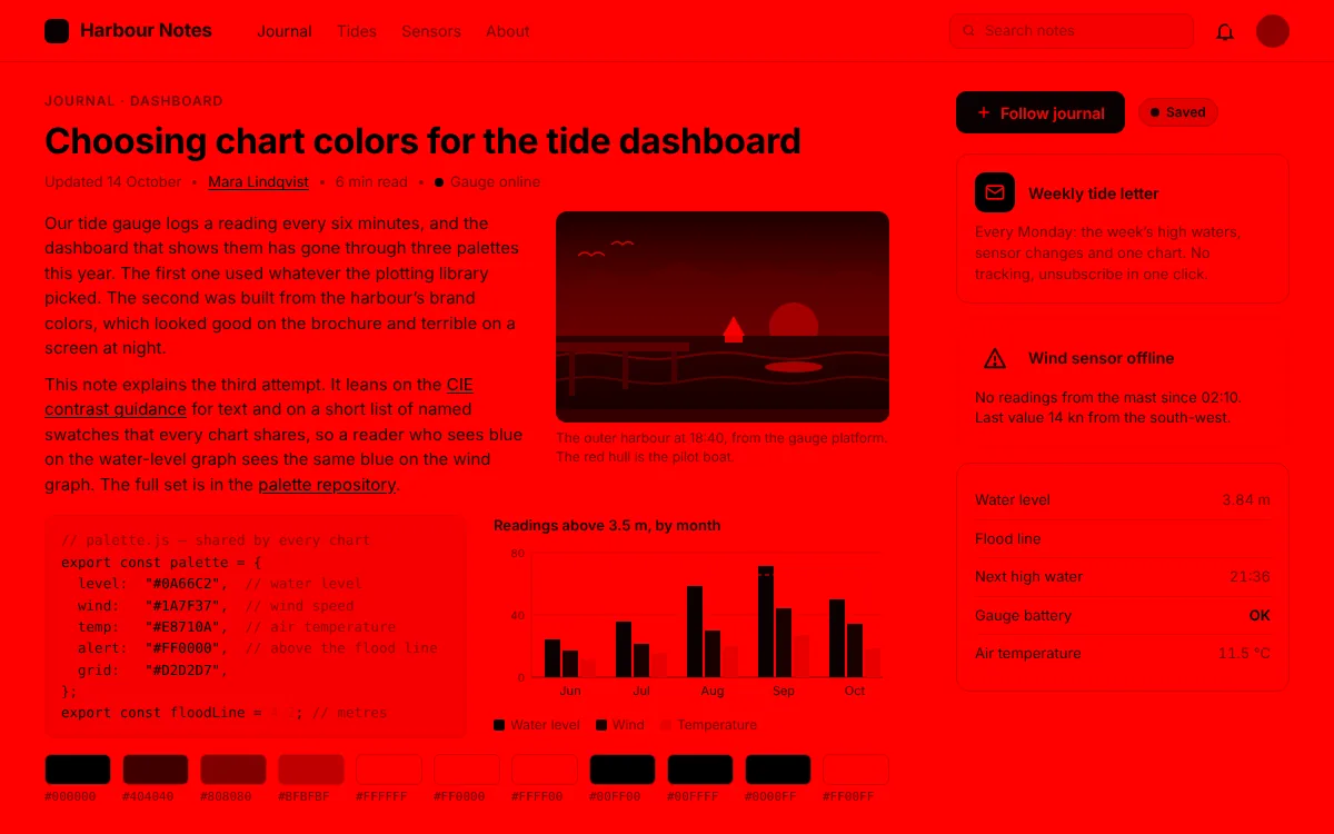
Simulated with Atapa’s own color math.
What Readable red does instead
Readable red keeps the green and blue outputs at zero, so there is still no blue in the tint, but it moves the content of those channels into red before they are dropped. At 800K and below, the red output is 0.30 times red plus 0.45 times green plus 0.25 times blue, in linear light. Blue and green stay switched off. The weights are close to how bright each channel looks, so a blue link ends up a darker red than the white background, and a green dot ends up a mid red.
The fold starts at 1500K and is complete at 800K: at 1200K it is about 39% in, at 1000K about 80%. Above 1500K the tint is an ordinary warm white point and nothing is mixed.
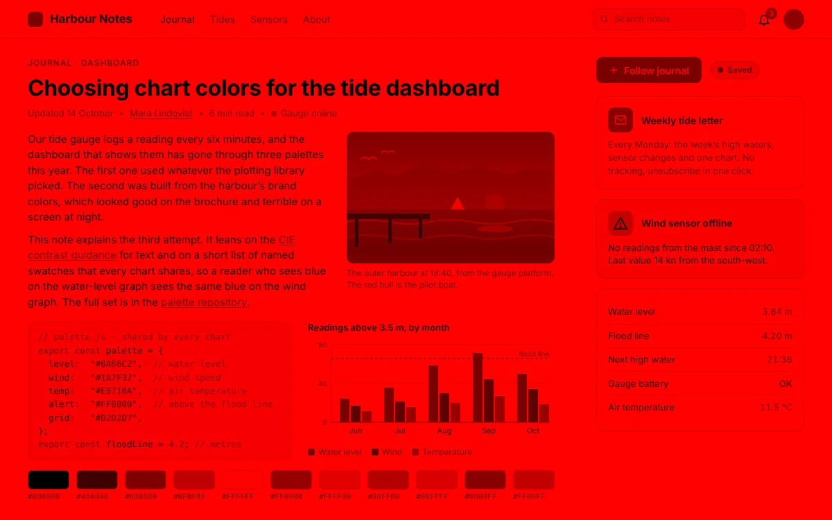
Simulated with Atapa’s own color math.
The numbers for a few colors
From Atapa’s own color math, applied to 8-bit sRGB inputs at 500K and re-encoded. The matrices are the ones the app sends to the display.
| Color on screen | Input (sRGB) | Plain red | Readable red |
|---|---|---|---|
| White background | 255, 255, 255 | 255, 0, 0 | 255, 0, 0 |
| Body text | 29, 29, 31 | 29, 0, 0 | 30, 0, 0 |
| Pure blue link | 0, 0, 238 | 0, 0, 0 (gone) | 127, 0, 0 |
| LinkedIn blue | 10, 102, 194 | 10, 0, 0 | 122, 0, 0 |
| Pure green | 0, 255, 0 | 0, 0, 0 (gone) | 179, 0, 0 |
| Leaf green | 52, 160, 72 | 52, 0, 0 | 119, 0, 0 |
| Sky blue | 120, 180, 240 | 120, 0, 0 | 184, 0, 0 |
| Black | 0, 0, 0 | 0, 0, 0 | 0, 0, 0 |
Black stays black in both. The difference is everything that was blue or green: gone on the left, a shade of red on the right.
Why the photos have to be photos
A screenshot of Atapa’s tint shows true color. The tint is applied in the display pipeline after the point where macOS captures the image, tested on a 14-inch M5 Pro with macOS 27.2 on 28 October 2026. That is good for sharing a screen and useless for showing the effect, so the frames on this page are simulated from the real matrices. Photographs of the panel, taken with a camera, will follow.
How much light is left
At 800K and below the white point is #FF0000: the green and blue outputs are zero. On a P3 panel, blue carries about 72% of a white screen’s melanopic signal and green about 28%; red carries almost none. Atapa’s evening ring therefore reads about 100% less alerting light at 500K. That is an estimate of the display’s output from CIE S 026 weights, not a measurement of your eyes, and the science page explains what it does and does not mean. The red that remains is dim too: the Midnight preset is 500K at 70% brightness, and the dim slider goes lower.
How to get there
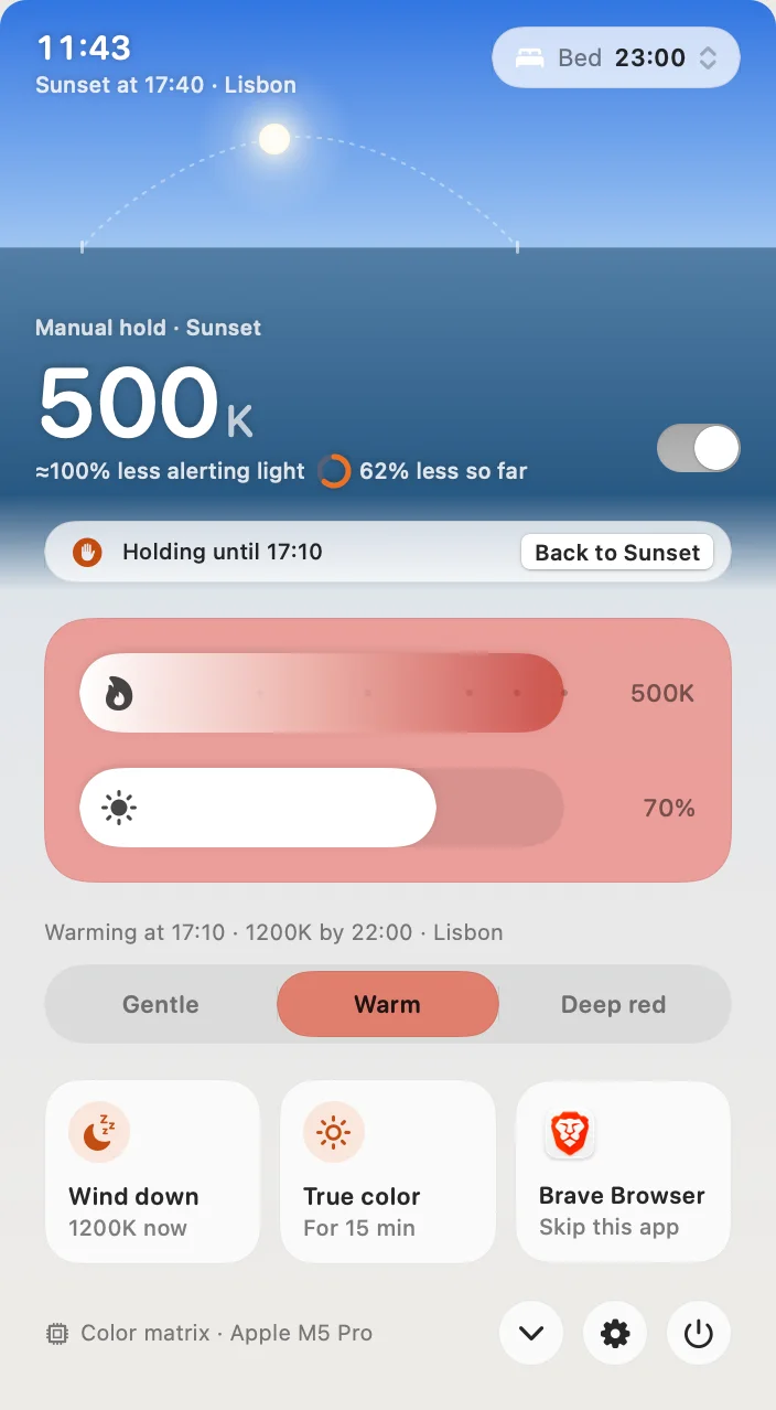
Three ways. Click Wind down in the popover to jump to tonight’s deepest stop; with the Deep red intensity that is 500K. Choose the Midnight preset, 500K at 70%, from Settings, General. Or drag the warmth slider to the bottom. Readable red is the default; Settings, Comfort, Red style switches to Pure red if you want the plain filter. Hold ⌥⌘T to see true color for a moment, and ⌃⌥⌘⌫ resets everything.
On an M5 Pro or M5 Max this is the only path to deep red we know of, because apps that tint through a gamma table change nothing there; the test is on the M5 page. On older Apple silicon Macs, Readable red works the same way. Gloam, a free open-source app, stops around 1900K; Night Shift stops at a mild orange.
Questions
What is Readable red?
Atapa's way of reaching deep red without losing the picture. Below 1500K the screen's blue and green content is folded into the red channel instead of being switched off. At 800K and below the fold is complete: red output is 0.30 of red plus 0.45 of green plus 0.25 of blue, in linear light, and the green and blue outputs are zero. A blue link that a plain red filter turns black stays visible as a darker red.
Is there any blue light left at 500K?
The tint itself has none: the green and blue outputs of the display are zero at 800K and below, so the white point is #FF0000 and Atapa's melanopic estimate is about 100% less than an untouched screen. What remains is the red primary, which carries almost no melanopic weight on a P3 panel (about 0.04% of white's melanopic output in our model). Black stays black.
Why does the website use simulated frames and placeholders instead of screenshots?
Because a screenshot of Atapa's tint shows true color. The tint is applied in the display pipeline after the point where macOS captures the image, tested on an M5 Pro with macOS 27.2 on 2026-10-28. The frames here are simulated with Atapa's own color math from the real matrices. Panel photos, taken with a camera pointed at the screen, are marked as not yet taken until they exist.
Who needs red that stays readable?
Anyone who works in the dark and needs to see the screen without losing dark adaptation or waking up: astronomers and astrophotographers at the eyepiece, pilots on a night flight deck, sailors on a night watch, darkroom work, and anyone reading in bed at 23:00. In every case a plain red filter that turns links and icons black is the problem Readable red solves.
Can I turn it off and get a plain red instead?
Yes. Settings, Comfort, Red style offers Readable red or Pure red. Pure red scales the channels only, which is what every other red filter does; pure-blue content goes black. Readable red is the default. The Midnight preset is 500K at 70% brightness, and Wind down jumps to tonight's deepest stop with one click.